This series of articles loosely documents design choices and implementation issues I met during the making of the tln website. I learnt a few lessons along my improvised 9-week schedule, and I thought I could share them with fellow first-timers. I guess some technical points might also be of interest to more experimented developers.
Designing the homepage
As with the Photos section, I searched for a minimalist homepage design by making a few drawings. I wanted something immersive, which put the focus on the art while still leaving much space to interpretation. I chose to quote Debord on the information part below the main picture, which is kind of an in-joke because Debord advocated against quoting respected authors? Otherwise, the remaining of the work here had almost become technical routine by then.
Amusingly, the very last element I added to the website was the homepage link in the navigation menu. For quite some time I hesitated to drop it altogether, because I wouldn't have much use for it, and also because I had no idea how to append it gracefully to the navigation menu, but mostly because I'd had more than my share of web development and I couldn't wait to put an end to it.
Perfectionism brought me back to reason (happens every time), as I recognized that users should be provided with a clear link to the homepage. This is especially true for users being referred by a social media link to an internal blog entry or movie review.
Pursuing cross-browser compatibility
Up until then, I'd used Chromium for development. Thanks to sticking to simple design rules, I was able to deal with mobile browsers rather straightforwardly. However, because different desktop browsers use different versions of different rendering engines, turning CSS into web page visuals will not produce the exact same results everywhere. Since it may imply painstaking debugging, dull rewrites and frustrating compromises, chasing after consistent results across most desktop browsers can easily become the most irritating part of web development.
Cross-browser testing is a vast issue which deserves to be read about on MDN. Browser support references for CSS and JS features can be found on CanIUse. Although it might be tempting to use Browserhacks for targeting specific browsers, I'd recommend against such inconsistent identification. Instead, consider feature detection or browser detection using the user agent. Additionally, several CSS resets provide a shared foundation to site-specific stylesheets.
Testing on Firefox
Here are the main problems I had to deal with for Firefox compatibility:
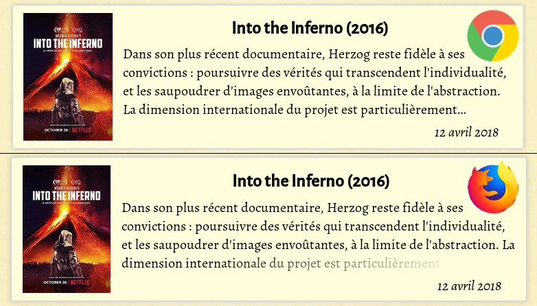
- Foolishly, I used the CSS
line-clampfeature which was not supported outside Chrome. I adapted a hackish workaround which simulated a text fade-out (see the result above). - On page load, Firefox fired transition events even though many assets weren't available yet. I thought about adding a loading animation for hiding content before the whole page was set, but that was actually sort of a bug linked to the simultaneous loading of resources. Somehow, it was fixed by reordering the CSS and JS scripts referral tags in the base HTML template.
- Words from several titles had different character spacing. This happened because I didn't load a native bold Alegreya font. Indeed both Firefox and Chrome tried to emulate it from the regular font, but they applied different settings for this.
Testing on Internet Explorer & Edge
The most reliable solution I found for testing for Microsoft browsers from a Linux OS was to use Windows virtual machines, available here for free. Virtualbox runs them just fine, except you might have to install guest additions to display desktops with a proper resolution.
I decided to support up to Internet Explorer 10 on Windows 7, knowing that this would already require significant work and energy to carry out. As it happened, Edge support came pleasantly fast. Support for IE10 was messier, but mostly worked once I'd replaced the usual CSS flex* attributes with the proprietary, non-standard -ms-flex* ones. The worst part was definitely dealing with IE11, whose flexbox implementation differs from the standard in uncontrollable ways. I fear for the sanity of developers who have to provide support for earlier browsers.
Testing on Safari
Regarding Safari, I was disappointed not to find any free testing solution. Because they shared the same rendering engine until 2013, very similar results can be expected between Chrome and Safari, but I still wanted to check there was no issue here. Luckily, at that time, I was hosted by a couple of friends who had an iPad. I was able to verify there was virtually no difference between Chrome and Safari displays in my case. I hope it's the same with desktop Safari, but I don't find the Apple mindset encouraging for a bit.